
Data Plotly in QGIS to create interactive graphics
Learn how to use Data Plotly in QGIS to create interactive graphics with this step-by-step tutorial. Engage your audience with dynamic visualizations that showcase your spatial data and help deliver your message effectively. Start exploring the possibilities today!
Data Plotly in QGIS to create interactive graphics
This article focuses on showing how it works Data Plotly in QGIS, an excellent plugin that allows to generate interactive graphics with the data of map.
It is, without a doubt, a very interesting tool for inspection, spatial data analysis and visualization without leaving QGIS.
What is Data Plotly for QGIS?
The plugin repository of QGIS It is gigantic: there are plugins for practically any purpose. Some of them are really cool and make work easier for data analysts and GIS specialists, providing advantages that make it possible to carry out tasks with greater comfort. The Data Plotly plugin for QGIS 3 it’s one of them, and it’s really good.
This cool plugin it has clear functionality. Its main purpose is to generate easily graphics from the layers and data sets loaded into the project. Everything directly from the QGIS interface.
But not only that: its great advantage is the capacity for interaction. Data Plotly allows inspecting “ on the flight ” selected data sets, both from the graph like from the canvas of the map.
Graphics creation with Data Plotly in QGIS
Data Plotly works thanks to the Plotly library and the Python API, giving it interactivity. The graphics of this plugin they stand out for their simplicity without compromising their effectiveness.
This plugin, developed by Matteo Ghetta, unfold or add an extra panel inside QGIS to design and configure charts. The panel can be placed on the sides of the interface to allow viewing both the QGIS canvas and the configuration of the graph. The display parallel facilitates the interaction and control of both.
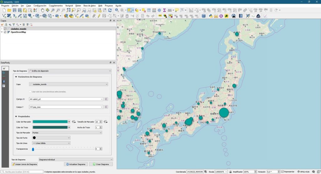
For generate a graph Your settings should be accessed from the first tab of the left side menu of the plugin. Once selected the type of diagram desired, you must choose the vector layer on which to build the graph, as well as select the field or fields that will function as variables.
The graphics they are customizable in different aspects: typology of graphic, symbolism and colors, definition and location of the legend.. As well as graph title, horizontal and vertical axis titles, etc.
Graphics types available in Data Plotly
Data Plotly allows the configuration of the following chart types:
- Dispersion charts
- Box and mustache diagram
- Bar chart or graph
- Simple Histograms and 2D Histograms
- Polar diagram
- Ternary diagram
- Sectors chart
- Contour Diagram
- Violin diagram
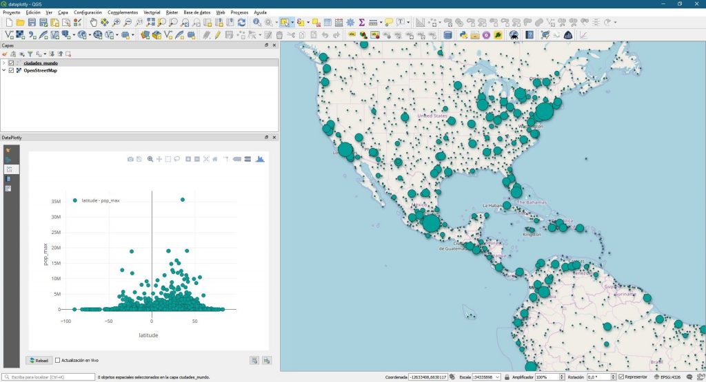
The graphics generated can be shown alternately both individually and multiplely. By generating multiple graphs these can be displayed in parallel, arranged in both columns and rows.
They can also be combined multiple graphics in one, obtaining different data visualizations within the same graph.
The graphics They can be exported both in image format and in HTML format to be shared on the web directly from Data Plotly.
Interactive selection between the QGIS canvas and the graph
One of the greats advantages of this plugin is the ability to link dynamic visualization between the canvas or QGIS map with the graphics built. In this sense, Data Plotly It will allow us two interesting actions in equal parts.
First, we can build any graph, and then with the “ box select ” or “ lasso select ” tools located on the graph, select certain dataset records.
As both elements are linked, the selection made will automatically be highlighted on the canvas of QGIS, being able to operate with it, export the selection to a new layer, etc.
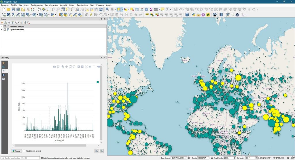
This option is tremendously useful for viewing and highlighting within our data set those that meet certain conditions according to the analysis imposed on the graph.
For example, from dataset used, we could select all those cities whose population is between 5M and 10M of inhabitants interactively. Or also select all those cities located near Ecuador and then apply another filter according to the registered population among those selected.
The second option that allows Data Plotly goes through performing the opposite operation. It would be about selecting certain values within the canvas as the source of the data. For example, we could select all the cities in India. A bar graph could then be made showing only data from the selected locations.
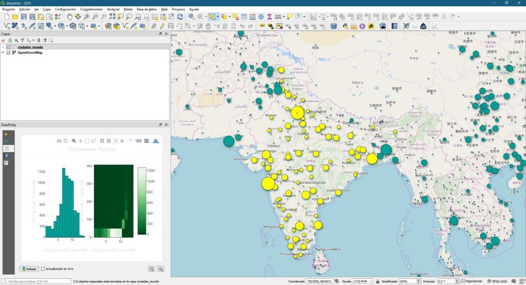
To do this, the “ Use only the selected features ” box located in the first Data Plotly panel, located under the layer selection dropdown, must be checked. Subsequently, the attributes must be selected and the graph generated.
Data Plotly applications and advantages
It’s about a plugin that can result tremendously useful for any study linked, for example, to geomarketing and market analysis, to spatial and geostatistical analysis of environmental variables, species distribution studies, demographic, political or mobility and logistics studies…
This is due, among other reasons, to the initial vector data analysis capacity it provides, the possibility of dynamically filtering and selecting part of the data set, as well as logically for the ease of visualization and layout of graphics.
Read More

